UX is Everywhere
UX is Everywhere
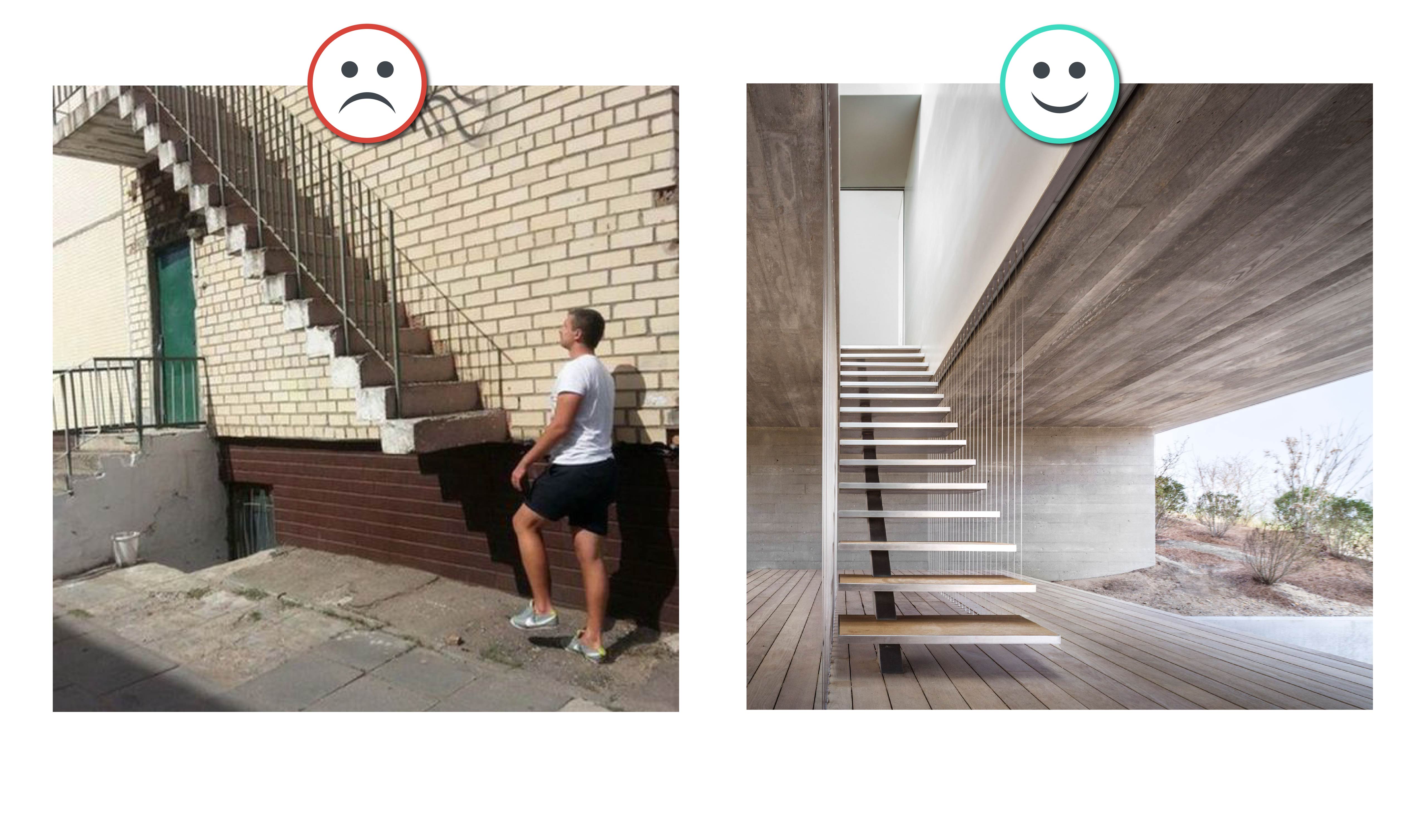
Don Norman, co-founder and principal emeritus of Nielsen Norman Group, in his book “The Design of Everyday Things” draws attention to the work ‘Coffeepot for Masochists’ in the ‘Catalog of Unfindable Objects’ by the French artist Jacques Carelman. Norman points out that with a handle placed on the wrong side, the user experience actually needs to be set correctly on everything interacted with.

UX is anything that affects the end-user’s interaction and perception of the product, its company and its services. In our daily life, we try to pull the doors that need to be pushed, those that need to be pulled. In moments of frustration caused by doors hitting our face, we find it difficult to understand whether the problem is with the product or with us. In fact, everything well designed distracts us from these complex thoughts. Everything we encounter in everyday life, such as a door, should show clearly how it works without the need for anything and without any wrong attempts.
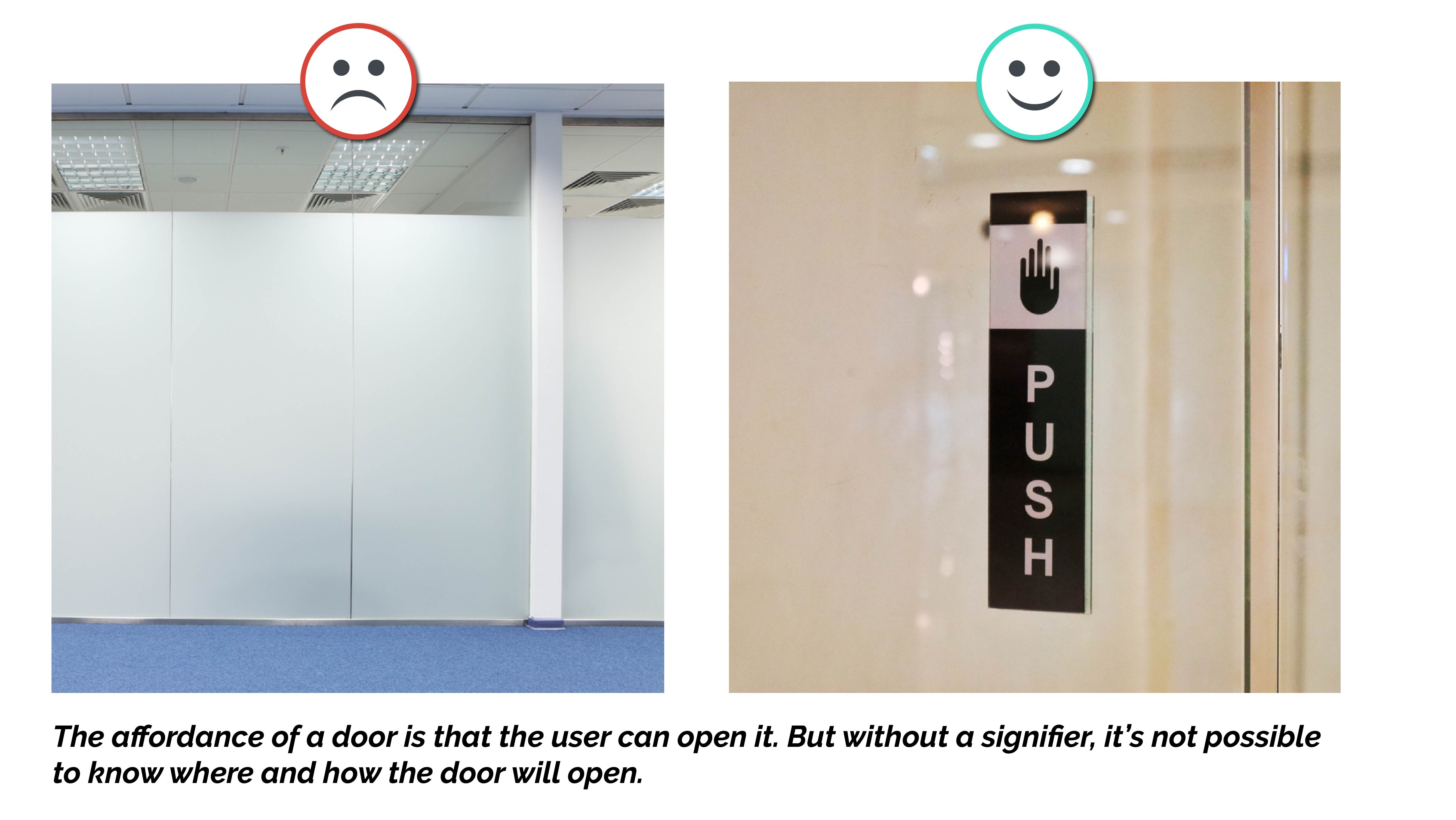
Two main features of good design stand out in user experience. These are understanding and discoverability. Understanding; to discover how to use the product and what it all means. Discoverability; It is about clarity about what actions are possible to take with the product or service and how and where this can be done. Discoverability is achieved through the proper application of five basic concepts. These are; mappings, constraints, feedback, signifiers and affordances. The signifiers, one of the two prominent concepts here, indicate which actions can be performed in an experience and how they will be done. However, affordances are possible interactions between the environment and users that are perceivable or invisible.
When users experience a system, they should be able to perceive the affordances without having to think about how to use it. For example, we need designs that tell whether to push or pull open a door, or to turn a knob into action. As Norman stated; The first requirement in the user experience is to meet the customer’s needs effortlessly. Good UX aims to experience something in a positive way rather than just being able to use it.
We need some methods to evaluate whether the design is good in daily user experiences. Web usability consultant and human – computer interaction researcher Jakob Nielsen described 10 usability heuristics of interaction design. These methods can be adapted to every product we use daily from the screens that are always in front of us.
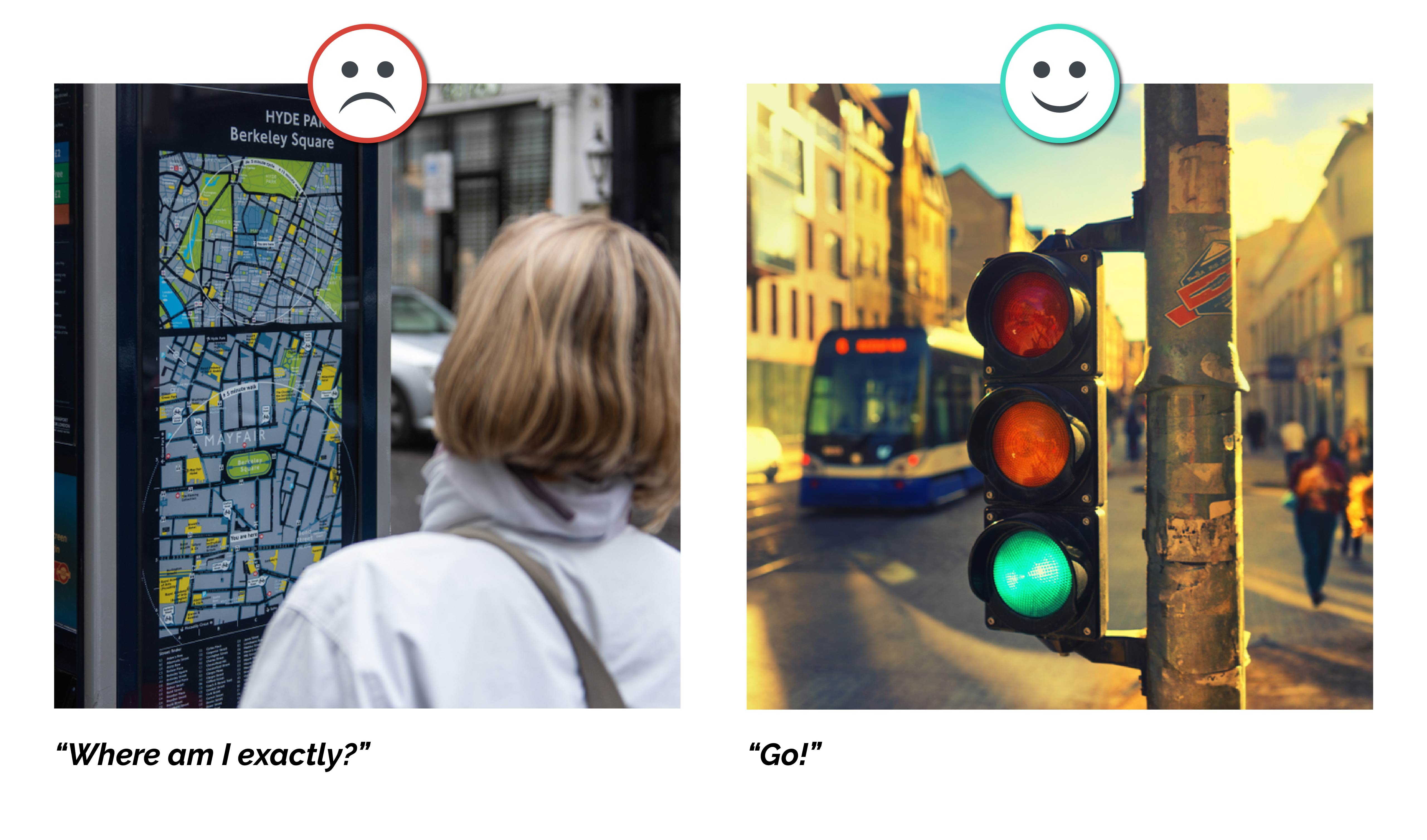
1. Keep users informed about their status
Designs should notify users of their interaction within a reasonable period of time with appropriate feedback. Predictable interactions increase trust and loyalty to both the product and the brand.
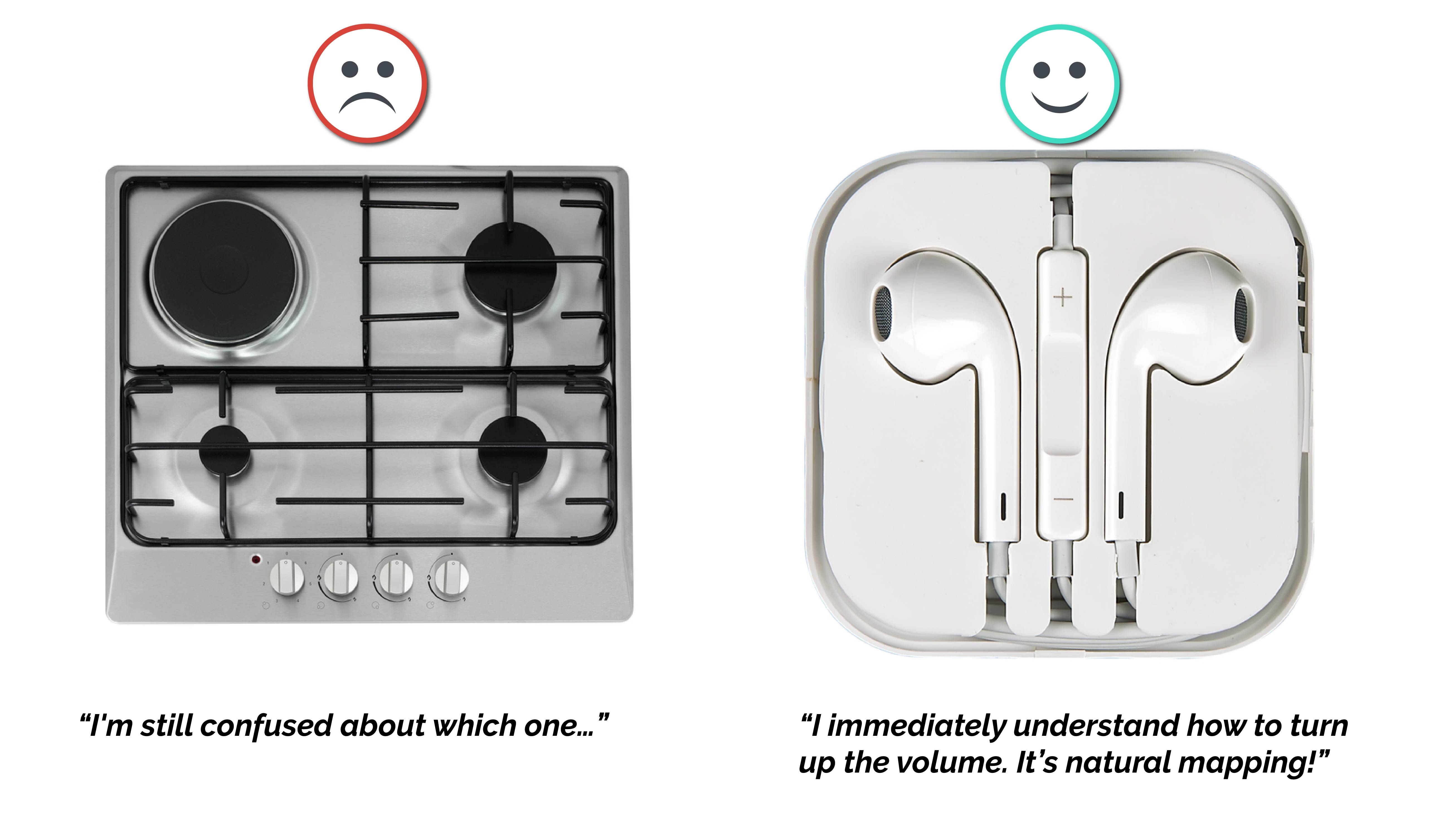
2. Show information in a way that users can understand
A connection should be established between the system and the user in the real world by using familiar words, concepts and symbols in designs. In a design, when the controller follows the real world, in other words, natural mapping is done, the user learns and understands how the experience works more intuitively.
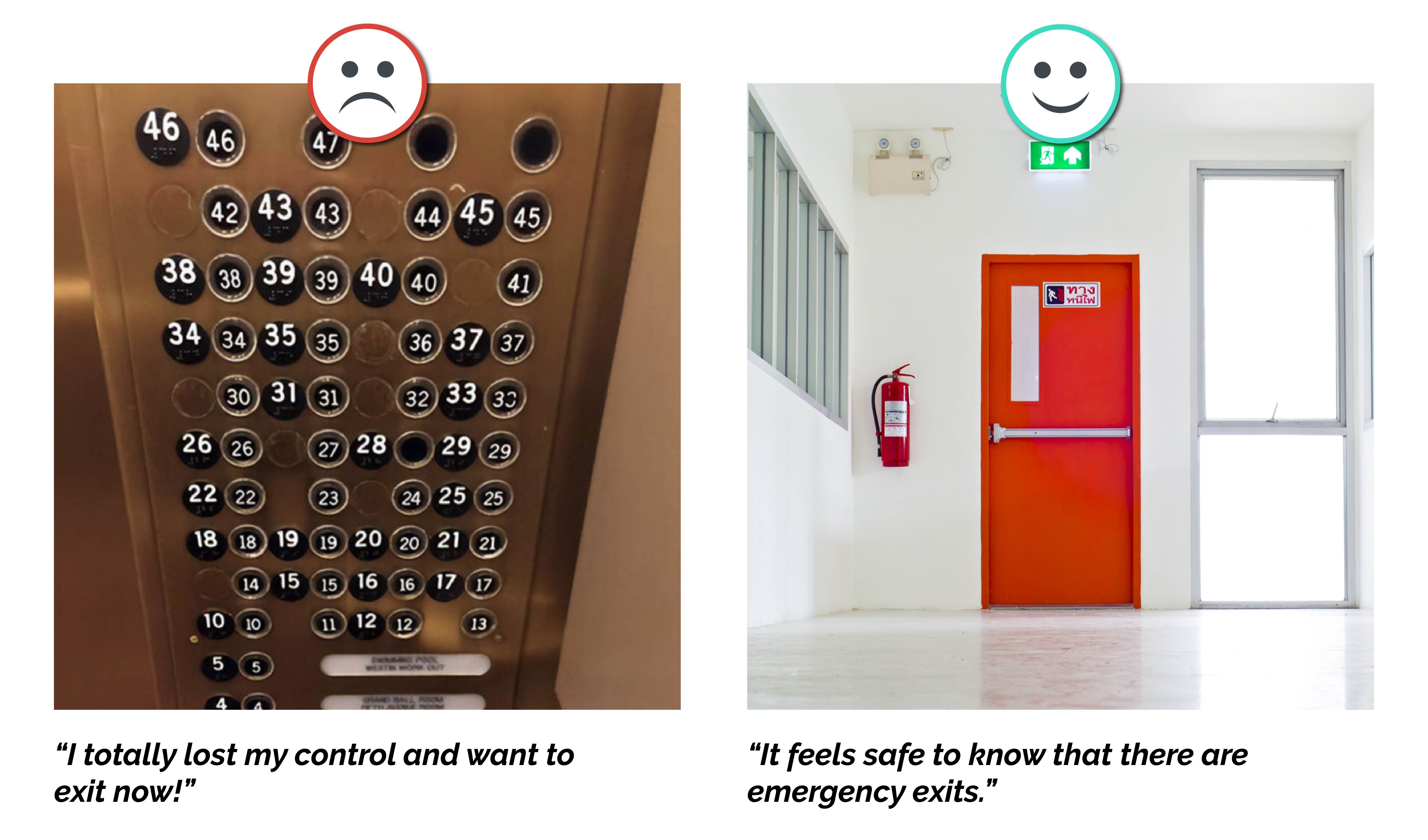
3. Offer users control
Users need an emergency exit to leave the system at some stage of their experience. This option helps users gain control of the system while also contributing to a sense of confidence and freedom. Thus, the user can leave the system at any time without being stuck somewhere and can take back their steps in case of error.
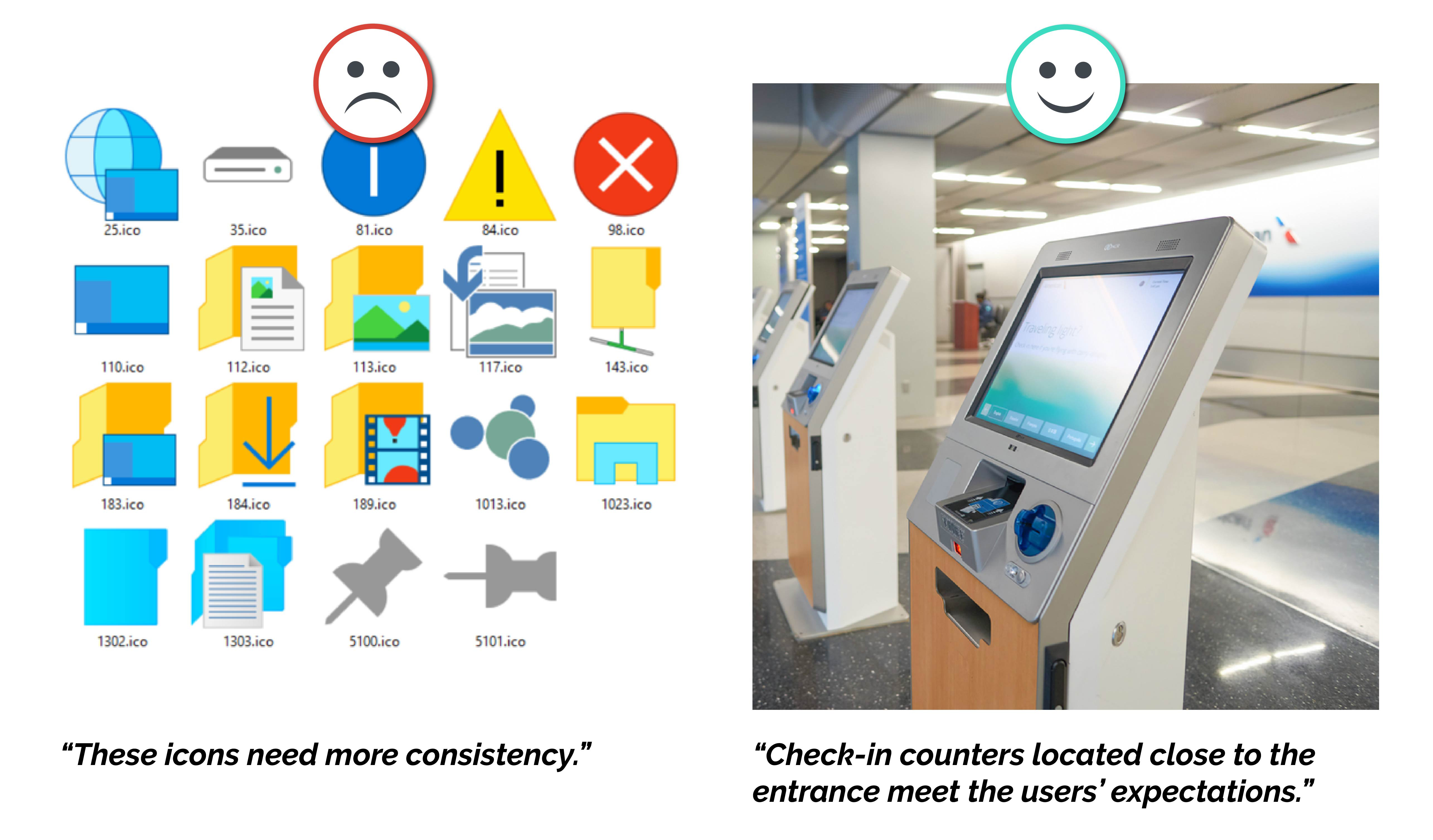
4. Be consistent and comply with the standards
Users know what to expect from products that meet standards and ensure consistency. In this case, learnability increases and complexity decreases in the use of a product. Users expect interactions from products that meet their familiar habits of similar products. When there is no consistency, designers have to try to learn something new and their cognitive load increases.
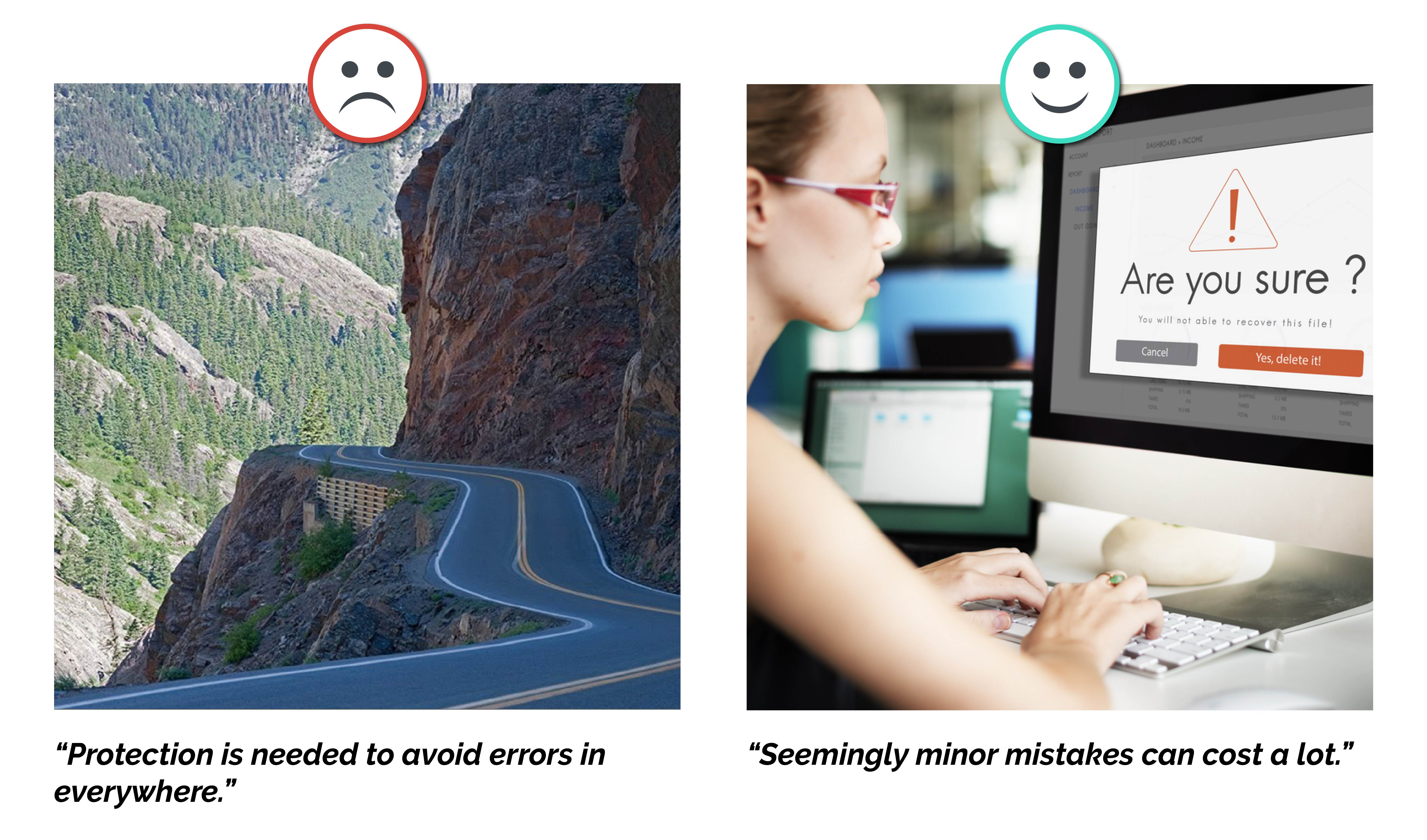
5. Prevent Errors
Although good designs are designed to prevent problems from occurring, it is very important to give clear and understandable error messages in the user experience. In fact, the mistakes made are based on the mismatch between the experience design and the user’s mental model. It is also important for good UX design to provide approval options before taking an important action while eliminating error-prone situations for users.
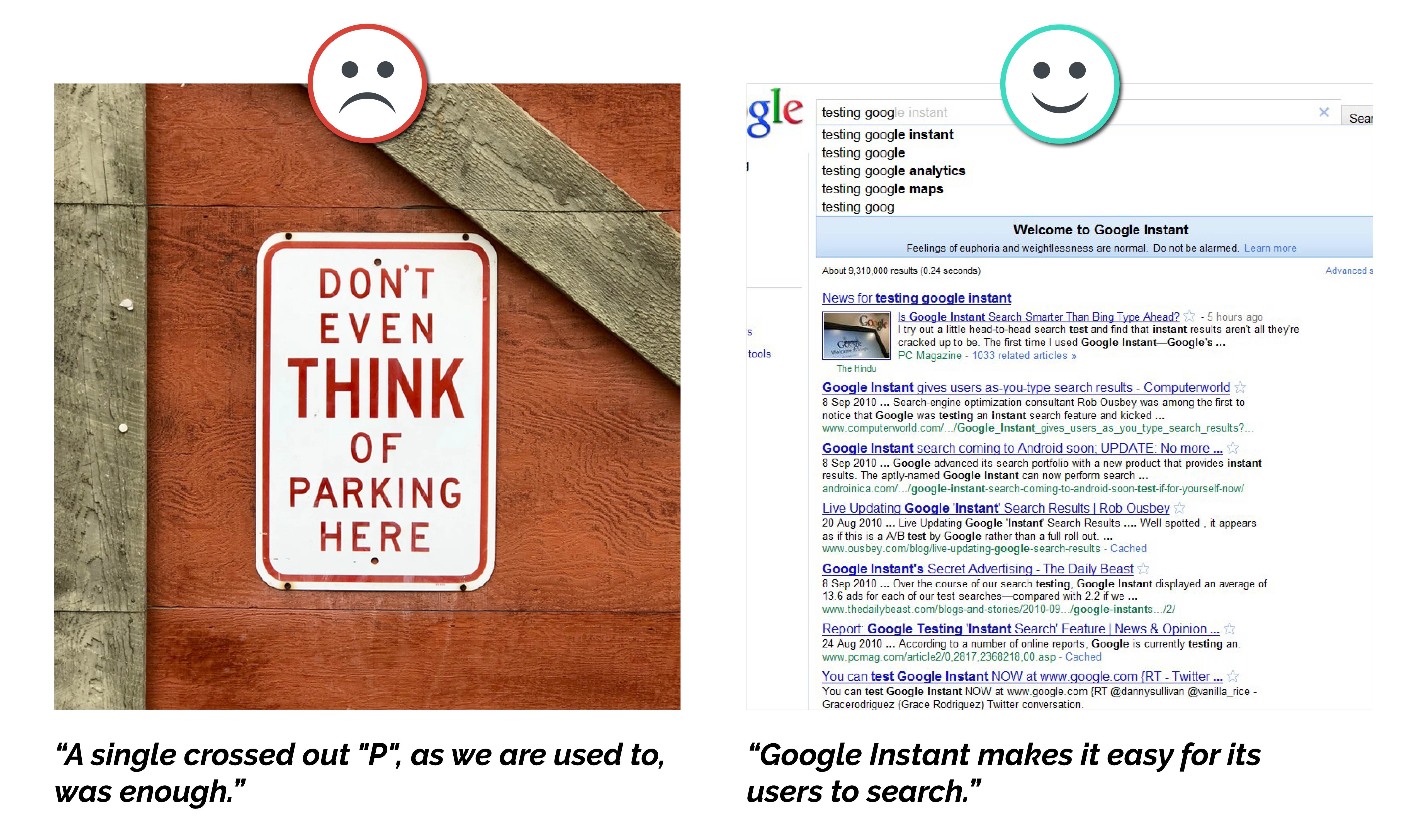
6. Provide visible instructions and information that allow users to recognize actions and options.
Instructions for the use of the system must be sufficiently visible to users and actions must be reversible. Thus, the memory load of the user is minimized. Since we have short term memory, we cannot have a good user experience when we have to remember the use of products and systems.
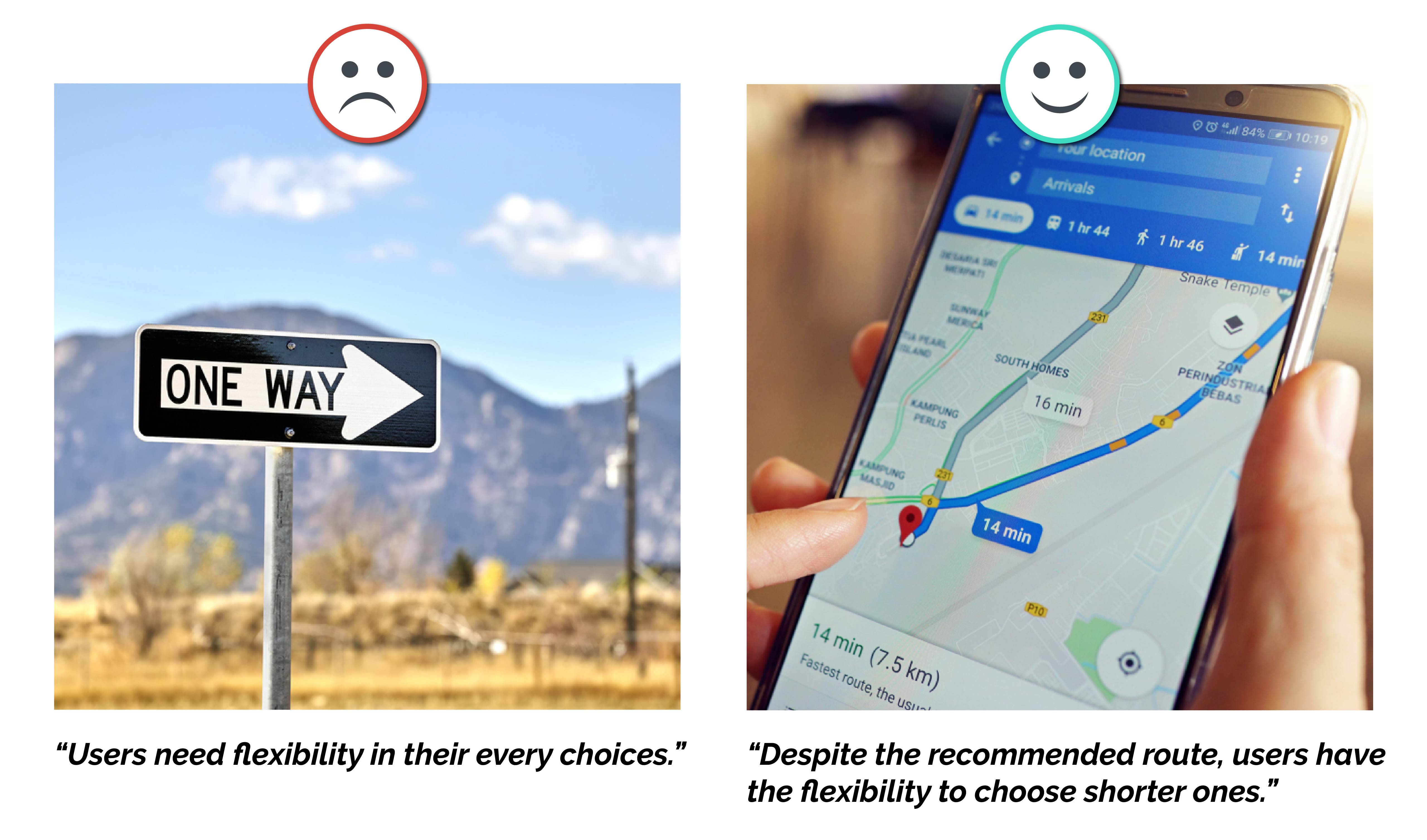
7. Be Flexible
Designs should be flexible enough to appeal to users of different competencies in user experience. Thus, experienced or inexperienced users can choose the most suitable method of use for them.
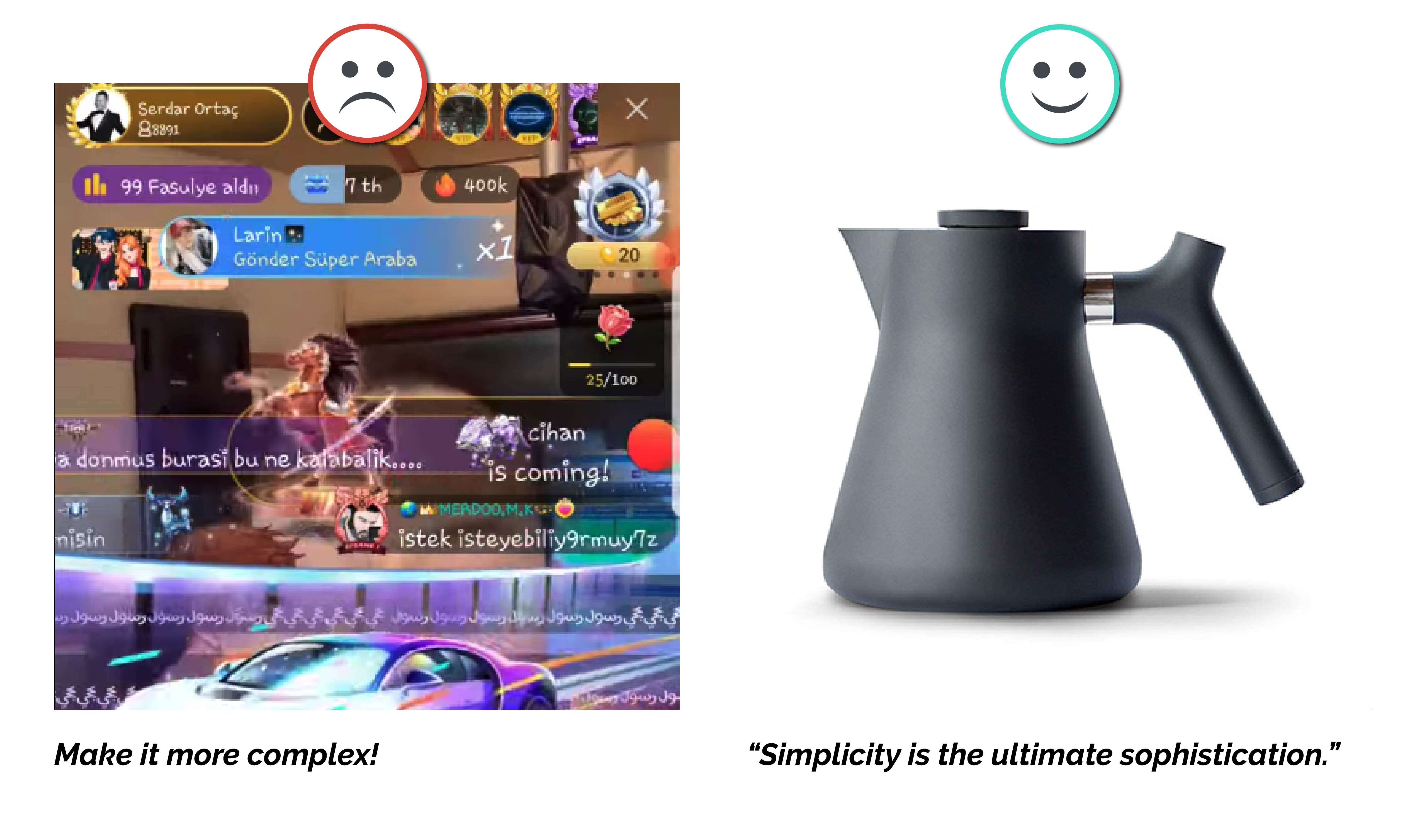
8. Have no clutter – be minimalist
Every extra detail in the products reduces the visibility and ignore the primary goal of the system. Prioritization and hierarchical organization of information and actions provide simplicity by reducing complexity while providing only information about current tasks is very important to avoid clutter.
9. Help users notice, understand and correct their errors.
Error codes and messages in systems should be clearly and simply expressed. The design should allow users to notice and recognize them quickly.

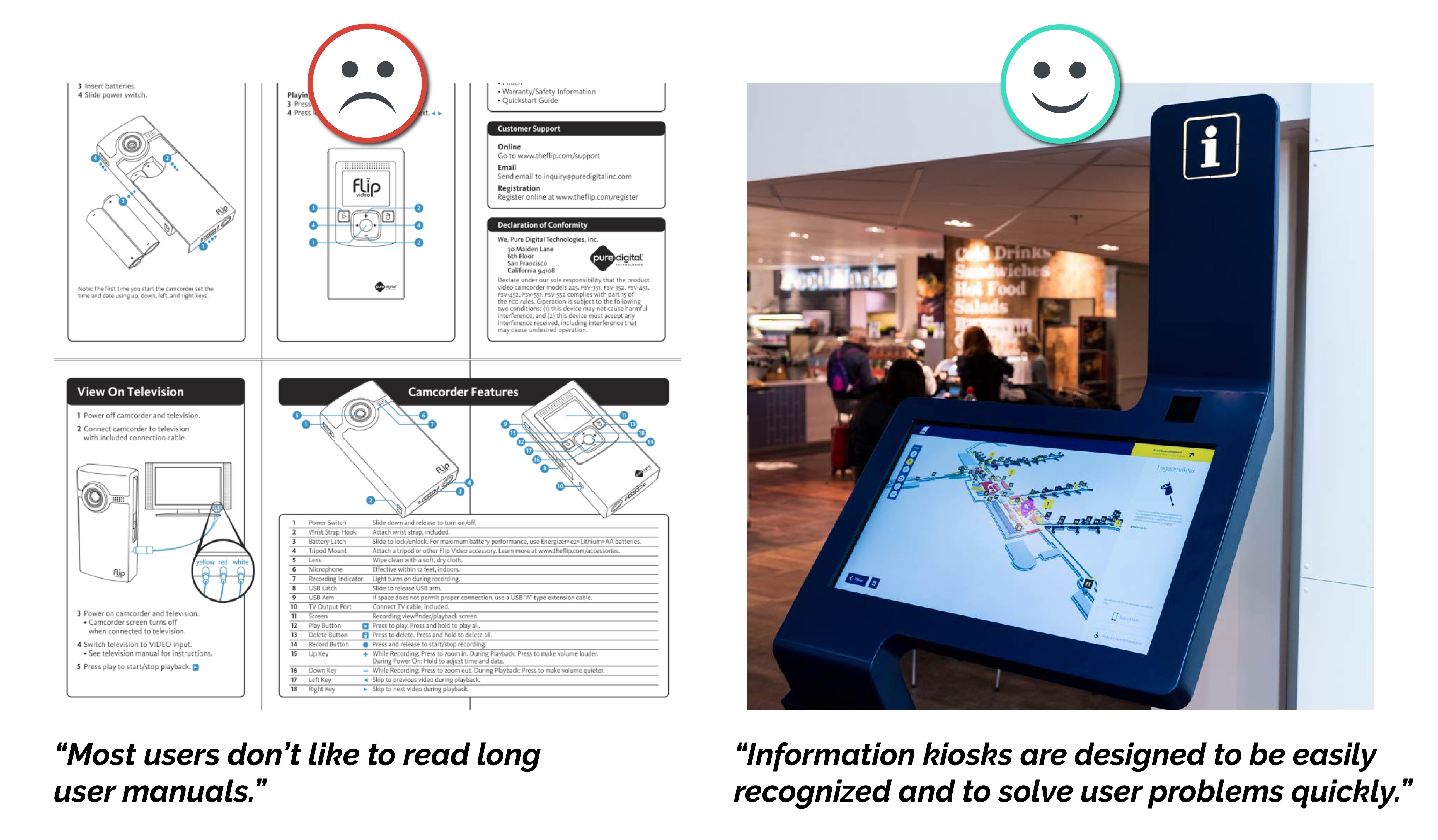
10. List the steps in simple and searchable documentation.
It is most plausible that the design is understandable without any additional explanation. However, it is also a good idea to provide helpful documents where they can find explanations of some tasks and rules. These documents should contain short, clear and concrete steps to improve the user experience.
We are experiencing our daily tasks mostly on the screens nowadays. UX is becoming more and more important in the digitalization process. Providing the best connection between digital systems and people makes our daily life better and makes our works easier. Contrary to popular belief, good design doesn’t appear. They are things that can be experienced intuitively easily and with positive emotions. Poor design, on the other hand, is instantly noticeable and seen everywhere. Providing a good user experience is a challenging process as well as a rewarding experience for everyone.
Reading Time: 5 minutes
Don’t miss out the latestCommencis Thoughts and News.


