Making a “Mad World” SmarterWorld Usability Day 2019
As each of us gets older the tech we use gets progressively more ingenious, but often times we find it progressively more difficult to use. Nowadays your refrigerator talks back to you, your toothbrushes have a mind of their own, your locks are the ones deciding who to let in and who to keep out.
Where the whole world used to be dumb and even sometimes mad, now just about every object you use in your daily life is busy collecting data, incorporating software for algorithmic operations, and connected to the internet so it can communicate with all the other items in the vicinity or with similar owners.
In a world where some people still haven’t really grasped how to use the remote control to the TV, making these items user-friendly for all and sundry can be quite the task, with plenty of designers clearly falling short at times.
Reading Time: 5 minutes
Don’t miss out the latestCommencis Thoughts and News.
As each of us gets older the tech we use gets progressively more ingenious, but often times we find it progressively more difficult to use. Nowadays your refrigerator talks back to you, your toothbrushes have a mind of their own, your locks are the ones deciding who to let in and who to keep out.
Where the whole world used to be dumb and even sometimes mad, now just about every object you use in your daily life is busy collecting data, incorporating software for algorithmic operations, and connected to the internet so it can communicate with all the other items in the vicinity or with similar owners.
In a world where some people still haven’t really grasped how to use the remote control to the TV, making these items user-friendly for all and sundry can be quite the task, with plenty of designers clearly falling short at times.
Don’t miss out the latestCommencis Thoughts and News.
Where World Usability Day Comes In
World Usability Day was created in 2005 to deal with this issue, to promote the values of usability, usability engineering, user-centered design, universal usability, and every user’s responsibility to ask for things that work better, which is why the day has also been called “Make things easier day.” It’s held on the second Thursday in November every year, with a different theme meant to enhance usability and bring communities together to make the world easier to use for everyone¹.
The idea is specifically to tackle the cliché of “the super intelligent guy who can’t even use the toaster or remote control correctly,” because fundamentally every device that controls our world should be as easy to use and intuitive as a chair or a doorknob. As technology becomes a part of the world’s every day infrastructure, design needs to keep up with how humans interact with that infrastructure and design accordingly.
What’s World Usability Day Focusing on 2019?
This year’s theme is “Design for the Future We Want.” This idea incorporates the inevitability of how technology will impact our future. We’re no longer in the dark ages when people genuinely wondered whether the Internet served any useful purpose whatsoever, we have at least a relatively strong sense regarding what the future will bring and the kinds of new technologies that await. So all that’s left to do is to design the future the way we want it to look.
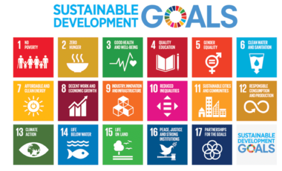
The theme was adopted in line with the United Nation’s 17 Sustainable Development Goals, which also focus on actively working towards creating a world we’d like to live in (one with equality for all, with sustainable practices, with healthy communities) rather than one haphazardly created to produce short-term profit without being integrated into a larger picture of what the world should look like.

Usability regarding UX and UI, which factors affect usability?
Notions of usability have changed to shocking degrees. While something resembling human beings have roamed the Earth for 200,000 years, electricity is a scant 100 years old, the automobile is similar. The home computer is not much more than 30 years old. The above video questioning whether we’ll ever even use the internet is just 25 years old, and today we’re used to a world where if a live stream buffers for a split second from a handheld computer that doubles as a phone, we get annoyed. Times sure have changed!
However, when it comes to design, the more things change the more they stay the same. Dieter Rams wrote in the 1970s, “Good design involves as little design as possible.” That design should be simple, intuitive, and elegant remains the core feature of modern design, just as it was 50 years ago.

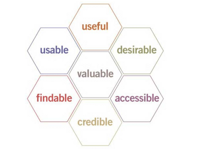
Peter Morville developed this simple honeycomb to describe user experience many years ago. It’s an easy way to see all the things that go into a user’s experience. Take any one of these out – let’s say we take out “credible” – then all of sudden your product is no longer one the user trusts. If you’re user can’t find, believe in, access, use, enjoy, and value your product, then there is something seriously wrong with your UX.
This means that the experience has to be well organized, with each step of the journey clearly identified and intuitive. To accomplish this, research and data evaluation are imperative, with the information collected therein organized into one integrated whole. The UI must anticipate what users expect and how they interact with technology in their everyday lives, and beyond that must anticipate how a range of different kinds of users from different backgrounds will do so.
.
How we design at Commencis to be as usable as possible
-
We design for the journey
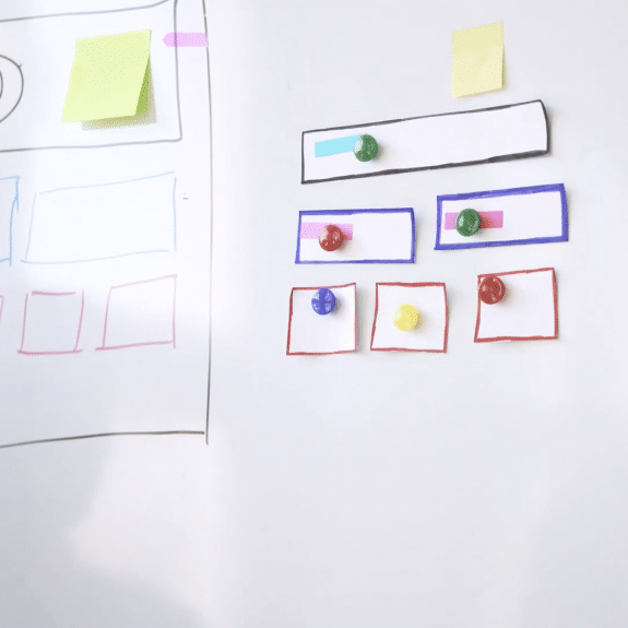
We employ a fast-paced concept design, first of all, we aim to focus on primary journeys and cover as many pieces as possible to see how a product behaves as a whole. These methods have massive advantages to serve the majority of users, for the majority of the time they spend with the products. However, while doing that we’re aware that secondary uncharted territories and edge cases may mean that there are design functions we haven’t covered.
We do our design team reviews which include all designers from other projects/products to go into detail and look for these conditions in order to ensure that they are fully fleshed out.
-
We believe in the power of working together
We don’t just design to hand over for build. We follow up with our designed experience through to the realization stage as well. Our developers demo with our design team what they have built for each sprint and we can avoid misunderstandings and collaborate on improving the product together.
-
We like guerilla testing
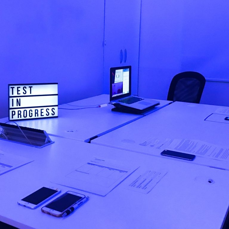
We love prototypes to be the same as the ultimate experience. Gathering user feedback and asking passersby for their thoughts is helpful to see some segments interacting with what our interpretation is. We learn and improve from there.
Key Takeaways
World Usability Day is a day that reminds us how far the world has come in such a short period of time, and encourages us to integrate how products will be used into designs in the future. New technology pops up all the time, and oftentimes design only takes short-term considerations into account. But as technology becomes more and more a part of how we interact with literally every facet of our life, it’s increasingly important that it’s designed specifically with this knowledge in mind, and incorporated into our preexisting knowledge of how life functions. In short, the smarter the technology, the more important it is that it become idiot-proof! So – to everyone out there, Happy World Usability Day from all of us at Commencis!


